Answer 8 quick questions to get a personalised quote from Webski
April 12 2011
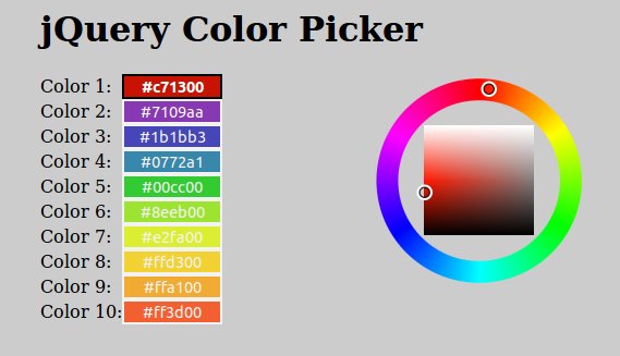
If you have experience in developing sites with a little bit complex user interaction there is a great possibility that you’ll use some color picker, especially if the site has some colour-choosing functionality. And that point you know how long can be inventing and creating a new color picker especially if you don’t know too much about colours and PHP or JavaSciprt functions that work with colours. The next dilemma is about choosing one of the many free colour pickers that will resolve your problem the best.
The colour picker that I want to suggest to you is called “Farbtastic”. Using jQuery as its JavaScript library provides easy implementation and customisation. Farbtastic is not created in flash and doesn’t use a divs with 1×1 pixel dimension instead of that is using transparent .PNG images combined in different layers.

Click » jQuery Color Picker – jQuery Colour Picker – Farbtastic « to view the live DEMO
Click » jQuery Color Picker – jQuery Colour Picker – Farbtastic « to DOWNLOAD the EXAMPLE
January 20 2011
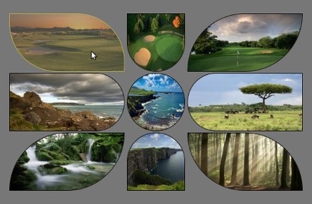

Click here » The IMGr jQuery Plugin used for Landing page with Rounded Images « to view the EXAMPLE.
Click here » The IMGr jQuery Plugin used for Landing page with Rounded Images « to download the full DEMO.
IMGr stands for Image Rounder and it’s a jQuery plugin and in this tutorial I used it to create a nice looking and unique landing page. For the developers it is very easy to create something that will be still and never be changed so the real troubles and headaches are coming when something twisted has to be editable from some CMS. This example can be easily modified to your CMS and these rounded images can be replaced from there; no need for photoshop editing of the images and creating PNG images that will be transparent because the images are normal rectangle .JPG images, just like these.

This is the HTML that I’ve used for this example.
<div style=”padding:100px 100px 200px 500px;”>
<div>
<a id=”link1″ href=“#”><img class=”ex1″ src=“timthumb1.jpg” height=”120″ width=”240″ /></a>
<a id=”link2″ href=“#”><img class=”ex2″ src=“timthumb2.jpg” height=”120″ width=”120″ /></a>
<a id=”link3″ href=“#”><img class=”ex3″ src=“timthumb3.jpg” height=”120″ width=”240″ /></a>
</div>
<div>
<a id=”link4″ href=“#”><img class=”ex4″ src=“timthumb4.jpg” height=”120″ width=”240″ /></a>
<a id=”link5″ href=“#”><img class=”ex5″ src=“timthumb5.jpg” height=”120″ width=”120″ /></a>
<a id=”link6″ href=“#”><img class=”ex6″ src=“timthumb6.jpg” height=”120″ width=”240″ /></a>
</div>
<div>
<a id=”link7″ href=“#”><img class=”ex7″ src=“timthumb7.jpg” height=”120″ width=”240″ /></a>
<a id=”link8″ href=“#”><img class=”ex8″ src=“timthumb8.jpg” height=”120″ width=”120″ /></a>
<a id=”link9″ href=“#”><img class=”ex9″ src=“timthumb9.jpg” height=”120″ width=”240″ /></a>
</div>
</div>
As you can see the HTML structure, there is one div that is used as a wrapper and three divisions within. Every division contains three image links and their dimensions are set exactly to fit with my design. These are the links that will lead you to the following pages of your web site. Every anchor has it’s own id and every image is associated to specific class. Now it’s time to use the IMGr plugin. Two javascript files must be included, first the main jQuery library and than the IMGr.
After the setup is done, it’s time to use the IMGr plugin. Let’s examine this line of code $(“img.ex1″).imgr({size:”1px”,color:”black”,radius:”0px 120px 0px 120px”}); Via first selector we have selected all images that are associated with ext1 class. The .img() method is applied to all these images. This method is wrapping the images with a span element and there are a few parameters that can be set.
First parameter is the size of the border that can be set and shown on the rounded image and it must be in pixels.
The second is the colour of the border. There are approximately 100 predefined colors such as aqua, azure, beige, bisque, black, blue, violet, brown etc. also you can write the hex code for the colour that you want.
Radius is the third parameter that can provide you to set the radius of every angle of the image and it must be in this format radius:”0px 120px 0px 120px”. Every number is associated with the radius of specific angle.
First – TL(Top Left); Second – TR(Top Right); Third – BR(Bottom Right); Fourth – BL(Bottom Left).
There is another parameter that can be set and that is the style of the border but I don’t use it for this example because its default value is set to “solid” and that was the style that I want to use so that’s why I don’t change it.
This will work on every browser including IE6. I’ve added one more functionality that created me troubles only in IE8 and I haven’t fixed it yet. I’ve added some pieces of jQuery code.
$(“img.ex1″).hover(function() {
$(this).imgr({size:”1px”,color:”yellow”,radius:”0px 100px 0px 100px”});
$(“#link1”).children(“span.imgr”).animate({opacity: ‘0.5’}, 80);
} ,
function() {
$(this).imgr({size:”1px”,color:”black”,radius:”0px 120px 0px 120px”});
$(“#link1”).children(“span.imgr”).animate({opacity: ‘1’}, 80);
} );
As you can see, I’ve created hover function for every image that makes some transformations such as changing the colour of the border (in this case to yellow) and changing the radius for some angles. Also I’ve used the .animate() method to create a nice animation that makes quick reducing the opacity of the image. Also there is a callback function that resets the changed properties to defaults.
Here is the full jQuery code, except for the other seven remaining images.
Click here » The IMGr jQuery Plugin used for Landing page with Rounded Images « to view the EXAMPLE.
Click here » The IMGr jQuery Plugin used for Landing page with Rounded Images « to download the full DEMO.
December 15 2010

In the process of creating a user friendly web form, the first thing that comes to the developer’s mind is to describe the kind of data that the user needs to input properly. Sometimes a simple label can do the trick, you put “Username” label in front of a text input field named username and all is done.
Problem occurs when, for an example, you want to tell to the user more info about the data that you want to be inserted in, so the label becomes longer. Eg. “Insert your first pet name”. The form labels have different length and the form looks messy.
One solution can be to top place the labels over the input fields but if we want to make it more stylish we can use the In-Field jQuery plug-in for that.
Click here » Using jQuery Plug-ins for better web forms (In-Field Labels) « to download the full demo.
")
To make the plug-in work you have to follow a special structure for the form layout. An example is:
<p>
<label for=”field_id”>Label Text</label><br />
<input type=”text” name=”field_id” value=”” id=”field_id” />
</p>
In addition to this some CSS is needed to position the label.
form p { position:relative }
label { position:absolute; top:0; left:0}
The wrapper around the label and the field can be any element you want. The <p> element here is just used as an example.
Now to make everything work, a small javascript is added:
$(document).ready(function(){
$(“label”).inFieldLabels();
});
and the effect is done.
")
This plug-in has two options that can be set when we initialise it. The first one “fadeOpacity” determines how much the label will fade when the input field is focused (default: 0.5) and the second, “fadeDuration”, controls how fast the animation is going (default: 300).
At the end it’s important to mention that sometimes this plug-in can have some problems with auto-complete forms. To prevent this just add autocomplete=”off” to the input fields that you have labels on.
Click here » Using jQuery Plug-ins for better web forms (In-Field Labels) « to download the full demo. Here you can see the original post.
December 7 2010
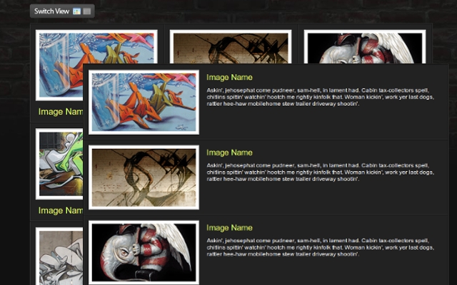
The web user today wants the sites to be more interactive and that interaction to be done on faster and more user-friendly level. Now I’m going to show you a few-step tutorial that will help you to increase the interaction on your site.
You can download » Creating switch view option using jquery and css « full demo files packed in zip file!
Lets start!
Down below you can see the HTML and CSS for the whole wrapper and its consist of unordered list with list items and their css attributes will be manipulated via jQuery to get the different view.
In every list item we put the content that consisting of div and image with link, heading and description within. For every element thats nested in the list item we associate and a style too.

I hope that you’ll find a perfect situation to use this example.
You can download » Creating switch view option using jquery and css « full demo files packed in zip file!
Beacause of the comment of Cyber Carl, I’ve created some new (reverse) version of this example first to load the grid and then to switch to list view; you can download it » Creating switch view option using jquery and css(reverse) «
October 26 2010
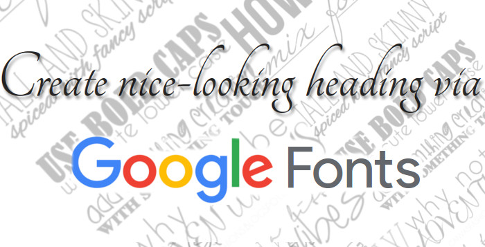
Create nice-looking heading via
Google Font API
When I wrote the last blog post I thought that was the last connected with typography, but I think that this is the ultimate solution for web designers who want to use different fonts instead the standard without using any techniques mentioned in the previous posts. I think that typography is very important part of the web design, so this will be dedicated to it too.
First we include the style-sheet file direct from the Google API site with the specifying the font family that we want to use. This project is in beta version and there are 25 fonts so far.
<head> |
<link rel=”stylesheet” type=”text/css” href=”http://fonts.googleapis.com/css?family=Tangerine” |
< |
This example is created and applied to span element but you can do it on every element that can contain text and this is the style for it.
<style> |
span { |
font-family: 'Tangerine', serif; |
} |
< |
| Next pece of html as we can see the span somtains pure text, no images, no flash. |
<span> |
The New Era of Web Design |
< |
This is the result:
The New Era of Web Design!
If we add this code text-shadow: 2px 3px 2px #888888; to the syle for the span element we will get nice shadow and this is the final product.
The New Era of Web Design!
September 27 2010
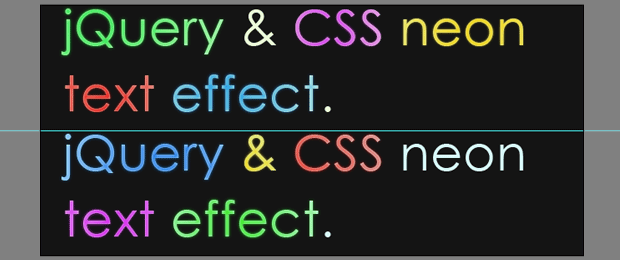
The previous blog post was creating glossy text using only CSS. In this post I’m going to show how to create Neon Glow Text, but this time I’m going to use some jQuery (a JavaScript library); besides, I’m going to use some CSS. Let’s start with the first step.
First of all we should create an image with the two different color versions of the text, and helped by the jQuery we can create a smooth transition between them. To create the image we’re going to use Photoshop, so we’re creating an empty 650px X 300px document and set #141414 as a hex code for background color.
For the text you can use your favorite font-family, for this example I’ll use Century Gothic with a size of 60px and I’ll type “jQuery & CSS liquid text effect” two times for the heading text.

After this pressing the Ctrl and click the text layer’s icon in the layers panel to select it.


You can choose a different color if you want but these are used for this example.

The final image shold look like this.
The HTML markap is very easy, we are going to use container (in this case h1) to wrap two span elements. The span elements will are having different id’s because they represent the different layers.
<h1 id="neonText">Neon Text Effect With jQuery & CSS. |
<span class="textVersion" id="layer1"> |
<span class="textVersion" id="layer2"> |
|
Layer1 is above the Layer2, and we are going to reduce it’s opacity to get an smooth neon glow effect.
The text is the best type of content for SEO because the crawler can’t read what’s written on the images.
This example is made using negative text-indent on the text but, with my last research i found that negative text event is used by many spammers, and it’s categorized as a “black hat” technique for SEO. So I’ve tried to comment the line for the text-indent and the whole exmple was working again.
/* The two text layers */ |
#neonText span{ |
width:700px; |
height:150px; |
position:absolute; |
left:0; |
top:0; |
background:url('img/text.jpg') no-repeat left top; |
} |
|
span#layer1{ |
z-index:100; |
} |
span#layer2{ |
background-position:left bottom; |
z-index:99; |
} |
/* The h1 tag that holds the layers */ |
#neonText{ |
height:150px; |
margin:180px auto 0; |
position:relative; |
width:650px; |
/*text-indent:-9999px;*/ |
} |
And the last step is the jQuery code. We are creating transformational animation between the two layers.
$(document).ready(function(){ |
setInterval(function(){ |
// Selecting only the visible layers: |
var versions = $('.textVersion:visible'); |
if(versions.length<2){ |
// If only one layer is visible, show the other |
$('.textVersion').fadeIn(800); |
} |
else{ |
// Hide the upper layer |
versions.eq(0).fadeOut(800); |
|
} |
},1000); |
}); |
You can download the source here
September 22 2010
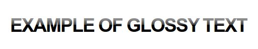
It’s the new era of the web design. Every web designer or developer that have some basic knowlage od SEO would know that the text is more SEO friendly than image. So if you want the text you want to emphasise to be a little trendy and for example to have a glossy look and sometmes you’ll say “OK I’ll make an image in photoshop with the text that I want and thats it”. I want to tell you that there is a solution for that problem and its solution that doesen using javascript, is’t pure CSS trick.
This is the final product:
This is the HTML for the glossy text. The only trick is that we put an empty span tag between the h1 tags.
This is the CSS. If you can notice the syle for the span inlcudes a background image that is a transparent PNG image. This image is a white shadow with height half of the height of the text, and it gives tha glossy effect. The other importat think in the CSS is that the h1 has a realtive but the span has an absolute position.
.glossy {
background: #000;
padding: 30px 0 30px 30px;
margin: 30px 0 50px;
}
.glossy h1 {
font: bold 310%/100% “Lucida Grande”, Arial, sans-serif;
position: relative;
margin: 0;
color: #fff;
text-transform: uppercase;
letter-spacing: -2px;
}
.glossy h1 span {
background: url(images/gradient-dark-stripe.png) repeat-x;
position: absolute;
bottom: -0.1em;
display: block;
width: 100%;
height: 29px;
}
This works in IE6 too, if you put this code between head tag.
This text can be used as a link an we can add another style for hover of the link and the text to become gray.
.glossy a {
color: #000;
text-decoration: none;
}
.glossy a:visited {
color: #000;
}
.glossy a:hover {
color: #555;
}
And the glossy link will look like this if we put an anchor tags before the span.

The full tutorial can be downloaded here.
September 21 2010
First of all I want to say Hi and Welcome to our Web Design Blog. This is our first blog post and as a introduction a few words about the basics of the web design. So comments are more than welcomed! Let’s start!
The elements that are using for web and print design are the same. The big difference between these two type of designs are the different rules that are implementing for each kind of design. Some print designs can not be implemented for web.
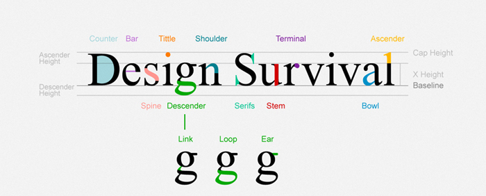
We must be careful when we want to use some font when its talking about web. There is a elis Fonts are the way your text looks on a Web page.
And most Web pages have large amounts of text. When you’re thinking of design, you need to think about how the text looks on a micro-level (the font glyphs, what font family, etc.) as well as the macro-level (positioning blocks of text and adjusting the size and shape of the text).
This is the list of font-family that can be used for web:
| font-family: Arial, Helvetica, sans-serif; font-family: ‘Arial Black’, Gadget, sans-serif; font-family: ‘Bookman Old Style’, serif; font-family: ‘Comic Sans MS’, cursive; font-family: Courier, monospace; font-family: ‘Courier New’, Courier, monospace; font-family: Garamond, serif; font-family: Georgia, serif; font-family: Impact, Charcoal, sans-serif; font-family: ‘Lucida Console’, Monaco, monospace; |
font-family: ‘Lucida Sans Unicode’, ‘Lucida Grande’, sans-serif; font-family: ‘MS Sans Serif’, Geneva, sans-serif; font-family: ‘MS Serif’, ‘New York’, sans-serif; font-family: ‘Palatino Linotype’, ‘Book Antiqua’, Palatino, serif; font-family: Symbol, sans-serif; font-family: Tahoma, Geneva, sans-serif; font-family: ‘Times New Roman’, Times, serif; font-family: ‘Trebuchet MS’, Helvetica, sans-serif; font-family: Verdana, Geneva, sans-serif; font-family: Webdings, sans-serif; font-family: Wingdings, ‘Zapf Dingbats’, sans-serif; |
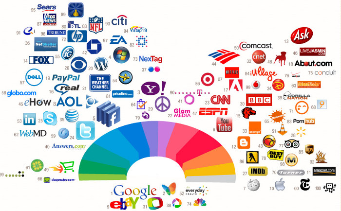
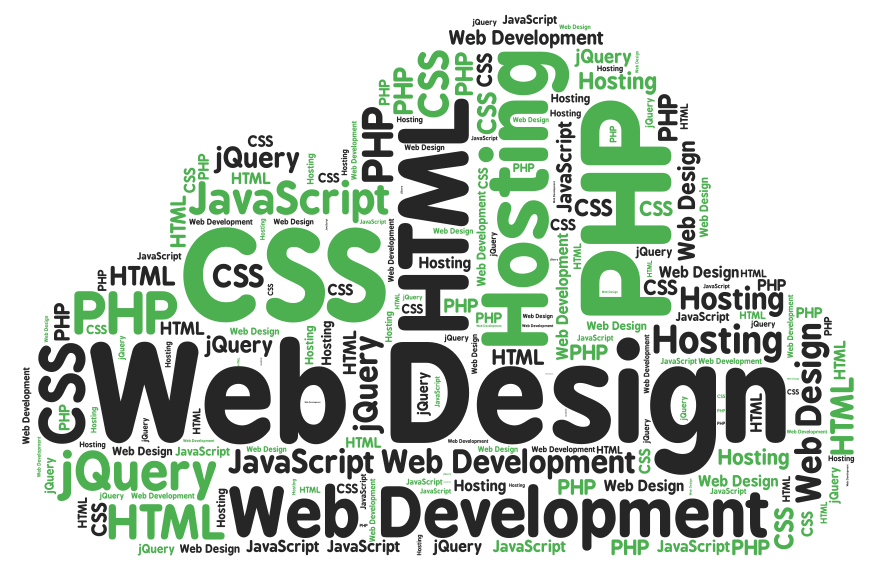
If you can notice form the image the most successful companies on the web are using the same pallete of colors for their logos and also for theis websites. Color is everywhere. It’s how we dress up our world and how we see things. Color has meaning beyond just “red” or “blue” and color is an important design element.
Graphics are the fun part of most Web pages. As the saying goes “a picture is worth 1,000 words” and that’s also true in Web design.
When people think of Web design often what they mean is the layout. Layout is the organization of elements on a Web page. First you need to start with basic design principles. Once you understand them, you can move through how to place elements on your Web page. These links and resources will take you through the steps to learn good Web layout design.
Navigation is how your customers get around from one page to another on a Web site. Navigation provides movement and gives your customers the chance to find other elements of your site. You need to make sure that the structure of your Web site (the information architecture) makes sense so that your customers aren’t forced to simply use search.
Accessibility and usability are often seen as a detriment to Web design, but a good designer focuses on making their site useful to as many people as possible. The links below take you through the basics of making an accessible site without compromising the design.
Most Web designers prefer to work in WYSIWYG or “What You See Is What You Get” editors because they provide a visual interface to the design. But finding the best Web design software is more than just WYSIWYG or not. Plus there are other tools you will need to build Web pages beyond just the Web editor.
For Windows and MAC the most popular WYSIWYG ediotr is Dreamweaver, but it’s not free.
There are WYSIWYG editors for other operating systems such as Linux to, one of them is Nvu. It’s comletly free. For Linux the Nvu verrion is called KompoZer open-source.
I want to share this post with you readers because I think it’s very useful and some information are taken from About.com some are written by me from my personal experience with the web design.
 Web Design
 Telco Drafting
 Marketing, SEO, PPC & Social
 Commercial & Residential
 Graphic Design
 3D Modelling
 Hosting & Support
 Game Development
 Mobile Apps
 Other Services