Answer 8 quick questions to get a personalised quote from Webski
December 15 2010

In the process of creating a user friendly web form, the first thing that comes to the developer’s mind is to describe the kind of data that the user needs to input properly. Sometimes a simple label can do the trick, you put “Username” label in front of a text input field named username and all is done.
Problem occurs when, for an example, you want to tell to the user more info about the data that you want to be inserted in, so the label becomes longer. Eg. “Insert your first pet name”. The form labels have different length and the form looks messy.
One solution can be to top place the labels over the input fields but if we want to make it more stylish we can use the In-Field jQuery plug-in for that.
Click here » Using jQuery Plug-ins for better web forms (In-Field Labels) « to download the full demo.
")
To make the plug-in work you have to follow a special structure for the form layout. An example is:
<p>
<label for=”field_id”>Label Text</label><br />
<input type=”text” name=”field_id” value=”” id=”field_id” />
</p>
In addition to this some CSS is needed to position the label.
form p { position:relative }
label { position:absolute; top:0; left:0}
The wrapper around the label and the field can be any element you want. The <p> element here is just used as an example.
Now to make everything work, a small javascript is added:
$(document).ready(function(){
$(“label”).inFieldLabels();
});
and the effect is done.
")
This plug-in has two options that can be set when we initialise it. The first one “fadeOpacity” determines how much the label will fade when the input field is focused (default: 0.5) and the second, “fadeDuration”, controls how fast the animation is going (default: 300).
At the end it’s important to mention that sometimes this plug-in can have some problems with auto-complete forms. To prevent this just add autocomplete=”off” to the input fields that you have labels on.
Click here » Using jQuery Plug-ins for better web forms (In-Field Labels) « to download the full demo. Here you can see the original post.
December 7 2010
The web user today wants the sites to be more interactive and that interaction to be done on faster and more user-friendly level. Now I’m going to show you a few-step tutorial that will help you to increase the interaction on your site.
You can download » Creating switch view option using jquery and css « full demo files packed in zip file!
Lets start!
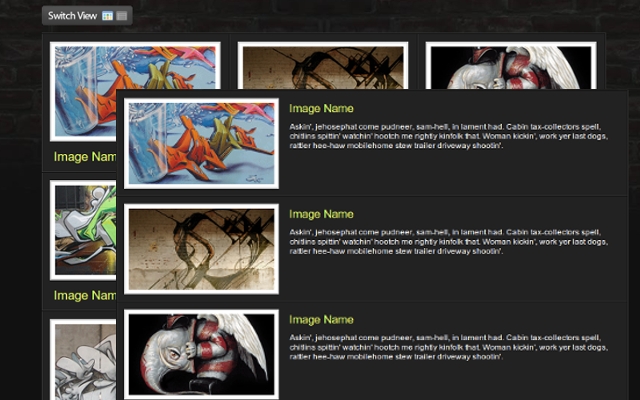
Down below you can see the HTML and CSS for the whole wrapper and its consist of unordered list with list items and their css attributes will be manipulated via jQuery to get the different view.
In every list item we put the content that consisting of div and image with link, heading and description within. For every element thats nested in the list item we associate and a style too.

I hope that you’ll find a perfect situation to use this example.
You can download » Creating switch view option using jquery and css « full demo files packed in zip file!
Beacause of the comment of Cyber Carl, I’ve created some new (reverse) version of this example first to load the grid and then to switch to list view; you can download it » Creating switch view option using jquery and css(reverse) «
 Web Design
 Telco Drafting
 Marketing, SEO, PPC & Social
 Commercial & Residential
 Graphic Design
 3D Modelling
 Hosting & Support
 Game Development
 Mobile Apps
 Other Services