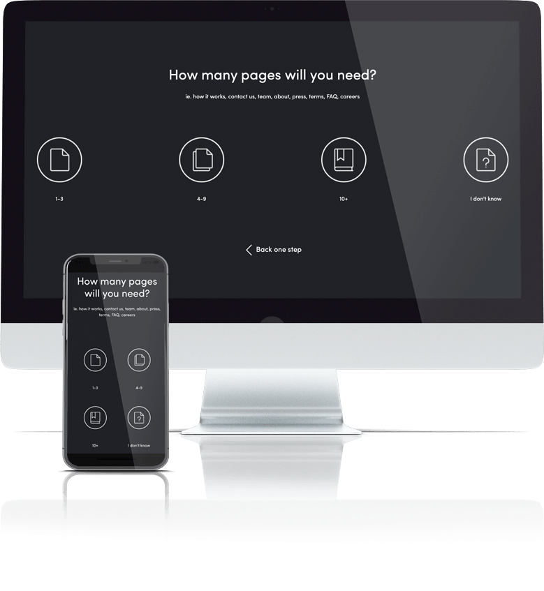
Answer 8 quick questions to get a personalised quote from Webski
November 3 2015
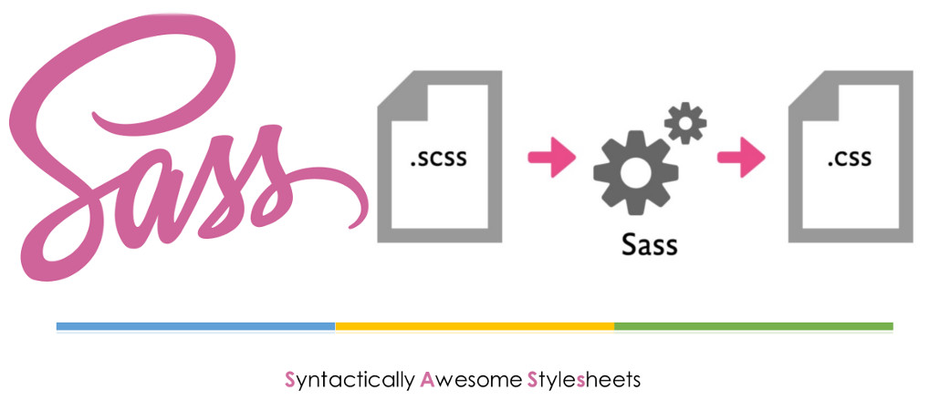
Sass is a stylesheet scripting language, an extension of CSS3. Sass (and other CSS preprocessors) can be a powerful ally, a tool that any style-crafter can easily insert into your daily work. It plugs the holes in CSS as a language, allowing you to write DRY code that will be faster, more efficient and easier to maintain.
Depending on what type of your operating system and the ability to work with command line there are a few ways how to install Sass.
If you don’t want to use the command line there area few installers some of them are paid but there are also a few of them that are free.
Hammer (Paid) (Mac)
Koala (Open Source) (Mac, Win, Lin)
Prepros (Paid) (Mac, Win & Lin)
Scout (Open Source) (Mac, Win)
The following ones are no longer working:
CodeKit (Paid) (Mac)
Compass.app (Paid, Open Source) (Mac, Win & Lin)
Ghostlab (Paid) (Mac, Win)
LiveReload (Paid, Open Source) (Mac, Win)
If you are quite familiar with using the command line you can use the following commands, depending on the OS that you are using:
If you’re using a distribution of Linux, you’ll need to install Ruby first. You can install Ruby through the apt package manager, rbenv, or rvm.
sudo su -c "gem install sass"
Before you start using Sass you will need to install Ruby. The fastest way to get Ruby on your Windows computer is to use Ruby Installer. It’s a single-click installer that will get everything set up for you super fast. The installer will also install a Ruby command line powershell application that will let you use the Ruby libraries.
If you prefer the command line over an application then getting Sass set up is a fairly quick process. Sass has a Ruby dependency but if you’re using a Mac, congratulations, Ruby comes pre-installed.
For more info you can always check the official site of SASS.

There can be a situation (and this actually has happened to me a few times), where the client wants his brand colour for instance to be “more red” and you should manually change that colour everywhere in the CSS. This can be done with Sass. You can define a variable for that colour and change its value in one place that will reflect in the entire stylesheet where the variable is used.
$brand-color: #b20000;

a {

  color: $brand-color;

}

nav {

  background-color: $brand-color;

}
Another simple and very handy example is the following one. Using Mixins for repeated blocks of styles that are used in various locations throughout the stylesheet. Mixin is a reusable block, defined only once but included wherever you needed them.
CSS only:
p {

  margin-bottom: 20px;

  font-size: 14px;

  line-height: 1.5;

}

footer {

  margin-bottom: 20px;

  font-size: 14px;

  line-height: 1.5;

}
Sass:
@mixin default-type {

  margin-bottom: 20px;

  font-size: 14px;

  line-height: 1.5;

}

p {

  @include default-type;

}

footer {

  @include default-type;

}
Recently one of our Web Developers at Webski organised an internal crash course for Sass that inspired me to write this post and he was more than happy to share his slides.
Feel free to download the Sass Presentation or the Sass e-book
December 7 2010
The web user today wants the sites to be more interactive and that interaction to be done on faster and more user-friendly level. Now I’m going to show you a few-step tutorial that will help you to increase the interaction on your site.
You can download » Creating switch view option using jquery and css « full demo files packed in zip file!
Lets start!
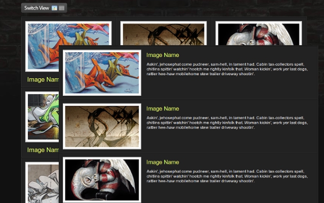
Down below you can see the HTML and CSS for the whole wrapper and its consist of unordered list with list items and their css attributes will be manipulated via jQuery to get the different view.
In every list item we put the content that consisting of div and image with link, heading and description within. For every element thats nested in the list item we associate and a style too.

I hope that you’ll find a perfect situation to use this example.
You can download » Creating switch view option using jquery and css « full demo files packed in zip file!
Beacause of the comment of Cyber Carl, I’ve created some new (reverse) version of this example first to load the grid and then to switch to list view; you can download it » Creating switch view option using jquery and css(reverse) «
October 26 2010
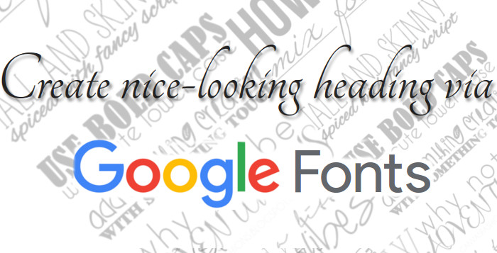
Create nice-looking heading via
Google Font API
When I wrote the last blog post I thought that was the last connected with typography, but I think that this is the ultimate solution for web designers who want to use different fonts instead the standard without using any techniques mentioned in the previous posts. I think that typography is very important part of the web design, so this will be dedicated to it too.
First we include the style-sheet file direct from the Google API site with the specifying the font family that we want to use. This project is in beta version and there are 25 fonts so far.
<head> |
<link rel=”stylesheet” type=”text/css” href=”http://fonts.googleapis.com/css?family=Tangerine” |
< |
This example is created and applied to span element but you can do it on every element that can contain text and this is the style for it.
<style> |
span { |
font-family: 'Tangerine', serif; |
} |
< |
| Next pece of html as we can see the span somtains pure text, no images, no flash. |
<span> |
The New Era of Web Design |
< |
This is the result:
The New Era of Web Design!
If we add this code text-shadow: 2px 3px 2px #888888; to the syle for the span element we will get nice shadow and this is the final product.
The New Era of Web Design!
September 27 2010
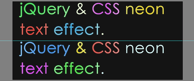
The previous blog post was creating glossy text using only CSS. In this post I’m going to show how to create Neon Glow Text, but this time I’m going to use some jQuery (a JavaScript library); besides, I’m going to use some CSS. Let’s start with the first step.
First of all we should create an image with the two different color versions of the text, and helped by the jQuery we can create a smooth transition between them. To create the image we’re going to use Photoshop, so we’re creating an empty 650px X 300px document and set #141414 as a hex code for background color.
For the text you can use your favorite font-family, for this example I’ll use Century Gothic with a size of 60px and I’ll type “jQuery & CSS liquid text effect” two times for the heading text.

After this pressing the Ctrl and click the text layer’s icon in the layers panel to select it.


You can choose a different color if you want but these are used for this example.

The final image shold look like this.
The HTML markap is very easy, we are going to use container (in this case h1) to wrap two span elements. The span elements will are having different id’s because they represent the different layers.
<h1 id="neonText">Neon Text Effect With jQuery & CSS. |
<span class="textVersion" id="layer1"> |
<span class="textVersion" id="layer2"> |
|
Layer1 is above the Layer2, and we are going to reduce it’s opacity to get an smooth neon glow effect.
The text is the best type of content for SEO because the crawler can’t read what’s written on the images.
This example is made using negative text-indent on the text but, with my last research i found that negative text event is used by many spammers, and it’s categorized as a “black hat” technique for SEO. So I’ve tried to comment the line for the text-indent and the whole exmple was working again.
/* The two text layers */ |
#neonText span{ |
width:700px; |
height:150px; |
position:absolute; |
left:0; |
top:0; |
background:url('img/text.jpg') no-repeat left top; |
} |
|
span#layer1{ |
z-index:100; |
} |
span#layer2{ |
background-position:left bottom; |
z-index:99; |
} |
/* The h1 tag that holds the layers */ |
#neonText{ |
height:150px; |
margin:180px auto 0; |
position:relative; |
width:650px; |
/*text-indent:-9999px;*/ |
} |
And the last step is the jQuery code. We are creating transformational animation between the two layers.
$(document).ready(function(){ |
setInterval(function(){ |
// Selecting only the visible layers: |
var versions = $('.textVersion:visible'); |
if(versions.length<2){ |
// If only one layer is visible, show the other |
$('.textVersion').fadeIn(800); |
} |
else{ |
// Hide the upper layer |
versions.eq(0).fadeOut(800); |
|
} |
},1000); |
}); |
You can download the source here
September 22 2010
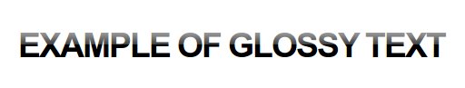
It’s the new era of the web design. Every web designer or developer that have some basic knowlage od SEO would know that the text is more SEO friendly than image. So if you want the text you want to emphasise to be a little trendy and for example to have a glossy look and sometmes you’ll say “OK I’ll make an image in photoshop with the text that I want and thats it”. I want to tell you that there is a solution for that problem and its solution that doesen using javascript, is’t pure CSS trick.
This is the final product:
This is the HTML for the glossy text. The only trick is that we put an empty span tag between the h1 tags.
This is the CSS. If you can notice the syle for the span inlcudes a background image that is a transparent PNG image. This image is a white shadow with height half of the height of the text, and it gives tha glossy effect. The other importat think in the CSS is that the h1 has a realtive but the span has an absolute position.
.glossy {
background: #000;
padding: 30px 0 30px 30px;
margin: 30px 0 50px;
}
.glossy h1 {
font: bold 310%/100% “Lucida Grande”, Arial, sans-serif;
position: relative;
margin: 0;
color: #fff;
text-transform: uppercase;
letter-spacing: -2px;
}
.glossy h1 span {
background: url(images/gradient-dark-stripe.png) repeat-x;
position: absolute;
bottom: -0.1em;
display: block;
width: 100%;
height: 29px;
}
This works in IE6 too, if you put this code between head tag.
This text can be used as a link an we can add another style for hover of the link and the text to become gray.
.glossy a {
color: #000;
text-decoration: none;
}
.glossy a:visited {
color: #000;
}
.glossy a:hover {
color: #555;
}
And the glossy link will look like this if we put an anchor tags before the span.

The full tutorial can be downloaded here.
 Web Design
 Telco Drafting
 Marketing, SEO, PPC & Social
 Commercial & Residential
 Graphic Design
 3D Modelling
 Hosting & Support
 Game Development
 Mobile Apps
 Other Services