Text With Neon Light Effect using jQuery & CSS
September 27 2010
The previous blog post was creating glossy text using only CSS. In this post I’m going to show how to create Neon Glow Text, but this time I’m going to use some jQuery (a JavaScript library); besides, I’m going to use some CSS. Let’s start with the first step.
Creating a Background Image
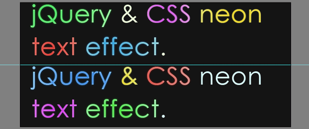
First of all we should create an image with the two different color versions of the text, and helped by the jQuery we can create a smooth transition between them. To create the image we’re going to use Photoshop, so we’re creating an empty 650px X 300px document and set #141414 as a hex code for background color.
For the text you can use your favorite font-family, for this example I’ll use Century Gothic with a size of 60px and I’ll type “jQuery & CSS liquid text effect” two times for the heading text.

After this pressing the Ctrl and click the text layer’s icon in the layers panel to select it.


You can choose a different color if you want but these are used for this example.

The final image shold look like this.
The HTML markap is very easy, we are going to use container (in this case h1) to wrap two span elements. The span elements will are having different id’s because they represent the different layers.
|
<h1 id="neonText">Neon Text Effect With jQuery & CSS. |
|
<span class="textVersion" id="layer1">span> |
|
<span class="textVersion" id="layer2">span> |
Layer1 is above the Layer2, and we are going to reduce it’s opacity to get an smooth neon glow effect.
The text is the best type of content for SEO because the crawler can’t read what’s written on the images.
This example is made using negative text-indent on the text but, with my last research i found that negative text event is used by many spammers, and it’s categorized as a “black hat” technique for SEO. So I’ve tried to comment the line for the text-indent and the whole exmple was working again.
|
background:url('img/text.jpg') no-repeat left top; |
|
background-position:left bottom; |
And the last step is the jQuery code. We are creating transformational animation between the two layers.
|
$(document).ready(function(){ |
|
var versions = $('.textVersion:visible'); |
|
$('.textVersion').fadeIn(800); |
|
versions.eq(0).fadeOut(800); |
You can download the source here

 Web Design
 Telco Drafting
 Marketing, SEO, PPC & Social
 Commercial & Residential
 Graphic Design
 3D Modelling
 Hosting & Support
 Game Development
 Mobile Apps
 Other Services