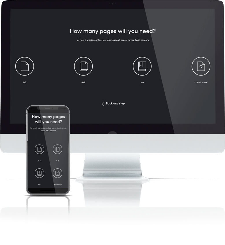
Answer 8 quick questions to get a personalised quote from Webski
October 23 2013
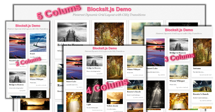
Let me introduce you the jQuery plugin that you’ll might use on the next project when the client will ask for a Dynamic Grid Layout similar to Pinterest.
I give you the BlockIt.js. It’s an easy-to-implement and light-weight jQuery Plugin for dynamic and responsive pinterest-like layout.
First, include the jquery min library then the blocksit java script in the head tag of the html:
<script type="text/javascipt" src="jquery.min.js">script>
<script type="text/javascipt" src="blocksit.min.js">script>
Then call the main function .BlocksIt() :
$(document).ready(function() {
   $('#container').BlocksIt({
      numOfCol: 5,
      offsetX: 8,
      offsetY: 8
   });
});
The following image describes what of the parameters in the main function stand for:

The following javasript code allows the resizing the browser and changing the number of coulms depenging the size of the screen:
var currentWidth = 1100;
    $(window).resize(function() {
        var winWidth = $(window).width();
        var conWidth;
        if(winWidth < 660) {
            conWidth = 440;
            col = 2
        } else if(winWidth < 880) {
            conWidth = 660;
            col = 3
        } else if(winWidth < 1100) {
            conWidth = 880;
            col = 4;
        } else {
            conWidth = 1100;
            col = 5;
        }

        if(conWidth != currentWidth) {
            currentWidth = conWidth;
            $('#container').width(conWidth);
            $('#container').BlocksIt({
                numOfCol: col,
                offsetX: 8,
                offsetY: 8
            });
        }
    });
And the following code is an example of how to implement the plugin.
<div id=”container”>
<div class=”grid”>
<div class=”imgholder”>
<img src=”/images/img1.jpg” />
</div>
<strong>Sunset Lake</strong>
<p>A peaceful sunset view…</p>
<div class=”meta”>by j osborn</div>
</div>
<div class=”grid”>
<div class=”imgholder”>
<img src=”/images/img2.jpg” />
</div>
<strong>Herringfleet Mill</strong>
<p>Just a herringfleet mill…</p>
<div class=”meta”>by Ian Flindt</div>
</div>
.
.
.
<div class=”grid”>
<div class=”imgholder”>
<img src=”/images/img3.jpg” />
</div>
<strong>Sundays Sunset</strong>
<p>Beach view sunset…</p>
<div class=”meta”>by Robert Strachan</div>
</div>
</div>
For this totorial I've uploaded the demo and the zip of the source files, use the following links:
Click » BlocksIt.js jQuery « to view the DEMO
Click » BlocksIt.js jQuery « to DOWNLOAD the EXAMPLE
December 7 2010
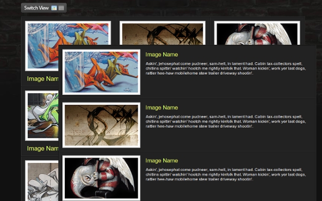
The web user today wants the sites to be more interactive and that interaction to be done on faster and more user-friendly level. Now I’m going to show you a few-step tutorial that will help you to increase the interaction on your site.
You can download » Creating switch view option using jquery and css « full demo files packed in zip file!
Lets start!
Down below you can see the HTML and CSS for the whole wrapper and its consist of unordered list with list items and their css attributes will be manipulated via jQuery to get the different view.
In every list item we put the content that consisting of div and image with link, heading and description within. For every element thats nested in the list item we associate and a style too.

I hope that you’ll find a perfect situation to use this example.
You can download » Creating switch view option using jquery and css « full demo files packed in zip file!
Beacause of the comment of Cyber Carl, I’ve created some new (reverse) version of this example first to load the grid and then to switch to list view; you can download it » Creating switch view option using jquery and css(reverse) «
September 21 2010
First of all I want to say Hi and Welcome to our Web Design Blog. This is our first blog post and as a introduction a few words about the basics of the web design. So comments are more than welcomed! Let’s start!
The elements that are using for web and print design are the same. The big difference between these two type of designs are the different rules that are implementing for each kind of design. Some print designs can not be implemented for web.
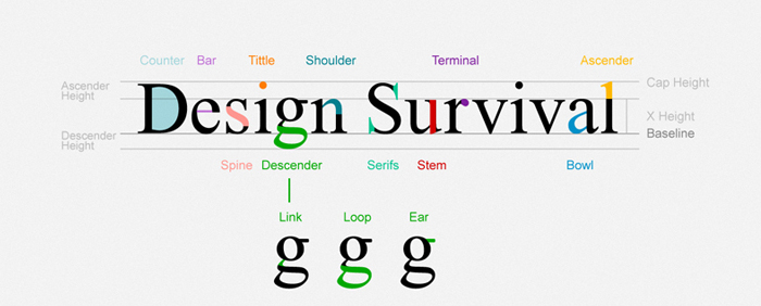
We must be careful when we want to use some font when its talking about web. There is a elis Fonts are the way your text looks on a Web page.
And most Web pages have large amounts of text. When you’re thinking of design, you need to think about how the text looks on a micro-level (the font glyphs, what font family, etc.) as well as the macro-level (positioning blocks of text and adjusting the size and shape of the text).
This is the list of font-family that can be used for web:
| font-family: Arial, Helvetica, sans-serif; font-family: ‘Arial Black’, Gadget, sans-serif; font-family: ‘Bookman Old Style’, serif; font-family: ‘Comic Sans MS’, cursive; font-family: Courier, monospace; font-family: ‘Courier New’, Courier, monospace; font-family: Garamond, serif; font-family: Georgia, serif; font-family: Impact, Charcoal, sans-serif; font-family: ‘Lucida Console’, Monaco, monospace; |
font-family: ‘Lucida Sans Unicode’, ‘Lucida Grande’, sans-serif; font-family: ‘MS Sans Serif’, Geneva, sans-serif; font-family: ‘MS Serif’, ‘New York’, sans-serif; font-family: ‘Palatino Linotype’, ‘Book Antiqua’, Palatino, serif; font-family: Symbol, sans-serif; font-family: Tahoma, Geneva, sans-serif; font-family: ‘Times New Roman’, Times, serif; font-family: ‘Trebuchet MS’, Helvetica, sans-serif; font-family: Verdana, Geneva, sans-serif; font-family: Webdings, sans-serif; font-family: Wingdings, ‘Zapf Dingbats’, sans-serif; |
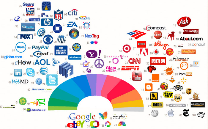
If you can notice form the image the most successful companies on the web are using the same pallete of colors for their logos and also for theis websites. Color is everywhere. It’s how we dress up our world and how we see things. Color has meaning beyond just “red” or “blue” and color is an important design element.
Graphics are the fun part of most Web pages. As the saying goes “a picture is worth 1,000 words” and that’s also true in Web design.
When people think of Web design often what they mean is the layout. Layout is the organization of elements on a Web page. First you need to start with basic design principles. Once you understand them, you can move through how to place elements on your Web page. These links and resources will take you through the steps to learn good Web layout design.
Navigation is how your customers get around from one page to another on a Web site. Navigation provides movement and gives your customers the chance to find other elements of your site. You need to make sure that the structure of your Web site (the information architecture) makes sense so that your customers aren’t forced to simply use search.
Accessibility and usability are often seen as a detriment to Web design, but a good designer focuses on making their site useful to as many people as possible. The links below take you through the basics of making an accessible site without compromising the design.
Most Web designers prefer to work in WYSIWYG or “What You See Is What You Get” editors because they provide a visual interface to the design. But finding the best Web design software is more than just WYSIWYG or not. Plus there are other tools you will need to build Web pages beyond just the Web editor.
For Windows and MAC the most popular WYSIWYG ediotr is Dreamweaver, but it’s not free.
There are WYSIWYG editors for other operating systems such as Linux to, one of them is Nvu. It’s comletly free. For Linux the Nvu verrion is called KompoZer open-source.
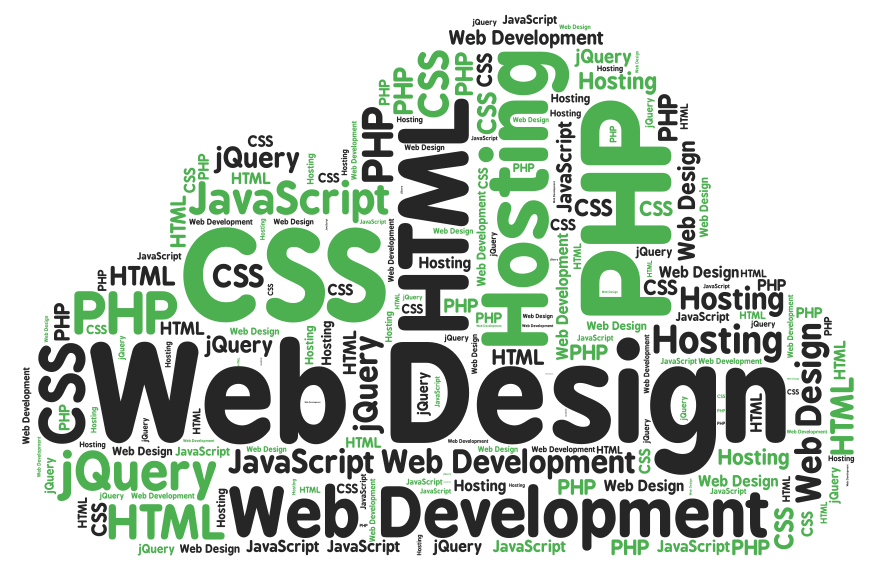
I want to share this post with you readers because I think it’s very useful and some information are taken from About.com some are written by me from my personal experience with the web design.
 Web Design
 Telco Drafting
 Marketing, SEO, PPC & Social
 Commercial & Residential
 Graphic Design
 3D Modelling
 Hosting & Support
 Game Development
 Mobile Apps
 Other Services