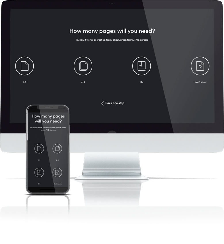
Answer 8 quick questions to get a personalised quote from Webski
October 10 2012

The home page is more general and offers information for the visitor, and the landing page is often used in conjunction with an ad campaign such as AdWords , it might contain a specific sales or a special offer and could be linked to or from an advertising campaign, it also helps convert a visitor seeking a product or service into a user, subscriber or into the action required on that page, usually into a potential client.
A landing page generally is created for the purpose of the expected users’ action on it – a form to fill out, so since you’re realizing an AdWords campaign and paying for the impressions and clicks you assume certain feedback or action of some kind. By these types of campaigns, traffic is sent from a pay per click (PPC) marketing campaign to one or multiple landing pages improved with the SEO techniques to correspond with the keywords the searcher used.
On the other, a home page is generally the information page of the company or service and the landing page is the one that turns traffic into money. Otherwise specified just think of a target image … a landing page is placing the arrow into the red centre.  The landing page is the introduction face of a website which may include unique quality content and fascinating web designs. These types of final products can be performed by SEO experts who can implement the proper optimization of your landing page content and its designs as well.
For the majority of website owners the landing page is just one of the pages from their website, which commonly is the home page or the main product page. It’s not a mistake attracting the customer’s loyalty by this way but if one wants a higher campaign results and return of investment (ROI) targeted links should point to a landing page that has the ability to keep the visitors on-site and turn them into constant customers.
The main key for the low visitors flow & the CTR, the number one mistake that contributes for crush of the conversion rate is usually the bad landing page!
That is the reason why marketers should use every opportunity they have to convince their clients that the web is a powerful visual medium hence except the unique content, the design & the branding of your products, the connection that attracts the visitor’s eye and makes them stay on page delivering your message at same-time provides info thus it maximizes the return of investment (ROI) and increases the revenue.
A professional landing page can attract the visitors with ease! Some of the important features of successful landing page are: the emphasis given on the service or the product, communication simplicity or message precision, on-brand design integration and a customer’s value proposition.
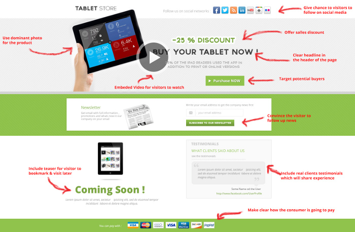
 Incorporate more interactive features as part of the users interface if you want more visitors’ on-page presence, instead of just showing a simple text. You have video on the page- that’s great! Some simple examples of landing-page-interactivity are embedded video that visitors can click and watch. Do not mistake this type of video with the one that is auto-playing with no mute button in any case.
Video can help a landing page convert better and it’s a proven conversion enhancement mechanism. The latest studies confirm that having video on the landing page is contributing up to 80% improvements in conversion.
Besides from that, it also improves the emotional and social connection of the products being sold and you can often use your video by placing it on YouTube & Google +.
Include some special “Coming Soon” or “Available in Monday” teaser-offer which can make the visitors bookmark the page and come back later.
Use a dominant photo image as your main shot: Use a product photo or, in the case of a service, you could use your logo or even a photo of your location. Make it clickable and don’t forget to add a benefit-rich caption and make sure that this image is being trustworthy and deliverers the benefits you offer. Never underestimate the importance of images and photos that can grab and hold the visitor’s attention.
Clear-ish headline or a nice and noticeable headline area is of a vital importance. Get to the focus fast and use the first 3-4 lines to say what you have to say. The visitor’s eye want to see what you are selling in the first few seconds that they land on the page so give them what they are looking for. Pay attention to the main title because it describes the final objective that matches people’s desires.
Focus on the middle of the page. Put your message, copy or image, close to the middle of your page and give an emphasis using the same colours palette on the visual elements from your ads on your landing page
Cleaner design: Make it simple and give to the user a nice and easy natural text to read with all the necessary details in the design.
Unique simple content! The landing page should be as clean as possible, easy-to-use; the content must be unique and not only that, but it has to be crafted in simple and persuasive form. The goal is to have the visitors to focus on the text you are trying to advertise and a good page design that supports the copy-write. Only copywriters who understand effective landing page design basics are skilled to craft such pages, share perceptions with designers and get final products aimed for creative & successful landing page designs.
Loading time – Slow pages lose money – Shrink the latency. No matter how great your website landing page design looks, if it loads too slowly visitors are unlikely to stay around. Depending on your marketing and your product service, strive for an 8-second or less page-load and make some necessary changes in order for your landing page to load quickly. Faster pages make a better user experience!

Convince the visitor to give you permission to follow up (by email, phone, etc.) and remember reduce the barrier in the entry form to a minimum. This includes registration of course or newsletter in return offer them statement with “Receive Updates on Webcasts” or “Participate in Webinars” , “Get the news first” instead of the cold negative interaction “Sign Up” . On long landing pages where the visitor is scrolling down for 5 or more pages use opportunity to remind the visitor about the goal of your page and place the CTA as a repeat on the bottom of the page or make it floating which moves as you scroll down. As verification to the CTA and a good way to say thanks, is to give the visitor the opportunity to spread the word out-there via Social media: Facebook, Twitter or Google +.
One important criterion in order to evaluate a landing page, even for the simple visitor: A landing page should clearly articulate what the consumer is getting and it should make clear how the consumer is going to get it.
Relevant client’s testimonials: Include real people testimonial with photos coupled with the name and the company name. They give more human touch to the product and encourage the user to become a customer.
Don’t forget, your landing page is your visitor’s last stopover to purchase a product or embrace a service, therefore target at the center and create professional landing pages that attracts visitors. The web content and the web design has to focus on boosting-up your visitor’s attention plus build confidence and trust in your product, service and your company.
September 17 2012
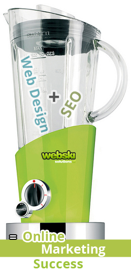
Webski Solutions is a leading Web Design Sydney, Web Development and SEO Company located in Sydney, Australia. We specialize in Web Design, Web Development, SEO, Online Marketing, E-Commerce, Developing iPhone / iPad Apps, Developing Android Apps, Graphic Design, Multimedia, 3D Design & Web Hosting. We exist to facilitate your way to online marketing success.
In today’s competitive business world it’s very important for the corporate companies and individuals to hire a professional web design and development company to meet their business needs.
Our highly experienced team provides cost effective solutions and quality services for our clients that is completely tailored to their companies Internet Marketing goals.
Having a professional designed and developed website is very important marketing instrument which ensure that your potential targeted group will know about your company and the services you offered and can locate your business easily. In a sea of thousands or millions competing websites you need to remain visible online and Search Engine Optimization (SEO) is the strategy that will ensure that your website is search engine friendly and will bring you a high rank on search engines like Google.
“Many web design companies skip the SEO in the process of design and development, but our company provides all necessary services that you need in order to achieve your marketing goals,” says Vlad, the CEO of Webski Solutions.
Professional web design and development combined with excellent SEO strategy is a perfect blend which will ensure your online presence. Call us now on 1300 932754 or just write to us on info@webski.com.au and guarantee your online marketing success.
For more details about our services visit webski.com.au
August 31 2011
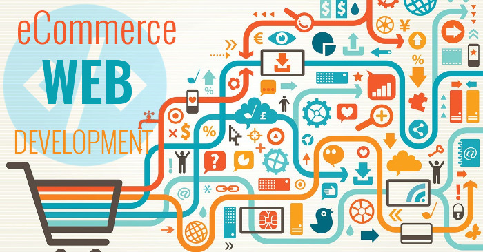
Ecommerce websites have their own unique character that is designed to lead the visitor to one simple task – make an online purchase. A web designer needs to consider a variety of online selling principles while designing an ecommerce website. In this article we will try to take a look at some of the major design aspects that you must have in an ecommerce website.
Many of you are probably already asking why ecommerce website design is different from any other website design. They all need to be attractive, well organised and use the right colors that fits the website spirit and so on. Your instincts are good. However a close look at some successful ecommerce websites will reveal the conceptual differences that are typical in a successful ecommerce website.
An ecommerce website needs to follow certain selling principles:
1. Give the user a pleasant experience during his online shopping.
2. Make certain you provide sufficient information on who owns the website and
why they should be trusted.
3. The website must be easy to use. If it isn’t, the visitor will go to your competitor.
Those principles are not new. We all know those basics from our day to day experiences at the local store, shopping center and every other market place that is waiting for us to open up our wallets. The big challenge for a web designer is how to translate those conventional marketing techniques to the virtual world of the internet. I’m sure you’ve all noticed that in most supermarkets the bread stand is placed at the far end of the building, yet you can smell the fresh bread at the entrance. That has been done deliberately. Marketers use our sense of smell to draw us through the store where we are exposed to all sorts of tempting goodies as we go to get our loaf of bread.
How do you draw an imaginarily path in a web page? A path designed to lead the visitor to do what you want him to do…make an online purchase. Unlike the supermarket our website has no smell. In a website the distance from one point to the other is pretty much the same, so the exit is always right there. In a website you can try to order the “shelf” in the way you think will best expose the visitor to many of your products, but there is always a chance that he will find a short cut to another page that can also be the way off your site.
As we can be see, although putting your products on the web is much easier then renting space and opening a supermarket. However, selling your products on the web can be difficult.
A good ecommerce website design will lead the visitor to the right page in one click or two at the most. Sometime web designers will use techniques that would never be considered for non-ecommerce websites. Everyone has seen at least one sales letter website. On these web pages the only link is to the order form. Sales letters are not the most typical ecommerce website because they usually sell only one product. That allows the web designer the ability to exaggerate the one click principle and make it an advantage. All the facts about the product have been presented to the user is a smart way while every few lines he has the option to click on the order form. If he is not yet convinced he will have the option to continue to read more facts and testimonials about the products. Believe it or not, those sales letter websites are actually selling.
“What about online shops?” Online shops have to deal with more then one product. Of course, the greater number of products increases the complexity of the website. Sophisticated ecommerce websites use a variety of personalisation technologies in an effort to determine the best selection of products to offer to the visitor. Personalisation technologies are a major part of advanced ecommerce websites. However this topic is beyond the scope of this article. The cleverness of an ecommerce website’s personalisation technology has a major influence on its design. The first to use such technology was Amazon.com who decided to push their client’s books to a visitor based on that visitor’s past orders combined with the statistics they had collected on all visitors used to predict what someone looking at a specific book might also be interested in reading. Today the goal is to try to predict what to offer the user on his first visit as well.
An ecommerce web design is also about the layout. One important aspect is where the user’s eyes look first when accessing a web page. Lots of research has been done on this topic. Most research showed that the middle left side area will attract the most attention followed by the center of the page. By using these techniques web designers try to draw the “walking path” for the visitor’s eye, much like what was done at the supermarket. An experienced ecommerce web designer will know how to create designs to meets those demands.
If you are about to open an ecommerce website or you are already own one, make sure you understand the web design principles for online selling.
If you ave any questions in regards to ecommerce web design and development do not hesitate to contact us and one of our friendly team members will help you out.
 Web Design
 Telco Drafting
 Marketing, SEO, PPC & Social
 Commercial & Residential
 Graphic Design
 3D Modelling
 Hosting & Support
 Game Development
 Mobile Apps
 Other Services