Answer 8 quick questions to get a personalised quote from Webski
December 2 2011

First of all, let me describe what is the definition and meaning of responsive content slider and responsive design in general. The websites can be browsed from many different browsers and also from many different devices like Smart Phones, Portable Computers, Laptops and desktops with different screen resolutions. If your site have prescribed design probably you’re going to have a problem with browsing the site from different browsers on different devices.
Really??? OMG! My site is viewed from different browsers and devices, is there any solution for this?
– Yes, there is and it’s called responsive design.
Ok I’ll discuss more about the responsive design in some of the next blog posts. Responsive content slider is a content slider that is working the same on every device. It will adapt the whole content even the images as well, for the device that you’re using. I think that you’ve got the idea that stands behind this, so let’s talk more about the content slider that I want you to use in some of your next projects.
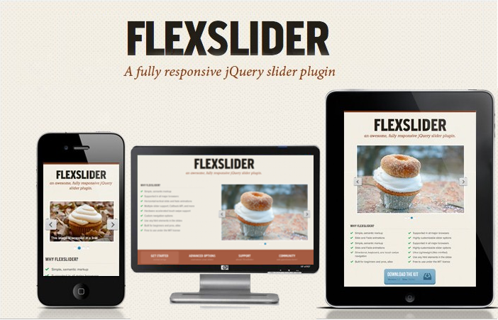
FlexSlider is the best responsive content that I have ever tried. It’s a jQuery based plugin that uses simple, semantic markup to create the slider that is lightweight, the minified version is weighing only 5 Kb. Completely open source, no limitation in any kind of usage. Tested in Safari 4+, Chrome 4+, Firefox 3.6+, Opera 10+, and IE7+. iOS and Android devices are supported as well.
The implementation of FlexSlider – the jQuery Content Slider plugin is very easy. Firs add the following cod in the head of the html.
<link rel="stylesheet" href="flexslider.css" type="text/css"><script src="https://ajax.googleapis.com/ajax/libs/jquery/1.6.2/jquery.min.js"></script><script src="jquery.flexslider.js"></script>
<script type="text/javascript" charset="utf-8"> $(window).load(function() { $('.flexslider').flexslider(); });</script>
<div class="flexslider"> <ul class="slides"> <li> <img src="slide1.jpg" /> </li> <li> <img src="slide2.jpg" /> </li> <li> <img src="slide3.jpg" /> </li> </ul></div>
And then you’re done! Enjoy!
Click » jQuery Slider Plugin – Flex Slider – Responsive jQuery Content Slider « to view the live DEMO
Click » jQuery Slider Plugin – Flex Slider – Responsive jQuery Content Slider « to DOWNLOAD the EXAMPLE
 Web Design
 Telco Drafting
 Marketing, SEO, PPC & Social
 Commercial & Residential
 Graphic Design
 3D Modelling
 Hosting & Support
 Game Development
 Mobile Apps
 Other Services