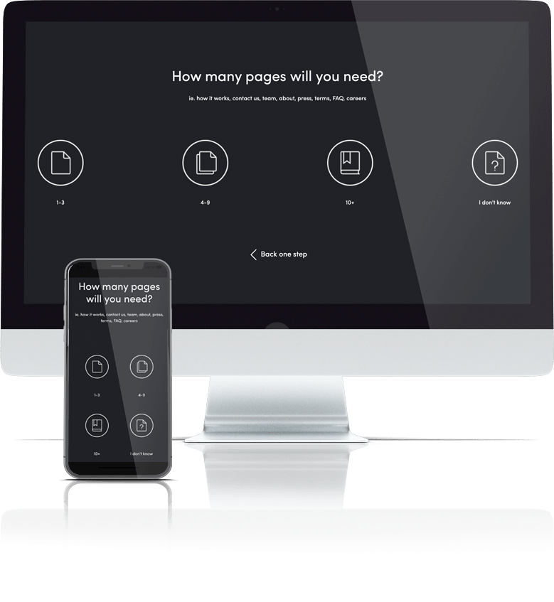
Answer 8 quick questions to get a personalised quote from Webski
October 10 2012

The home page is more general and offers information for the visitor, and the landing page is often used in conjunction with an ad campaign such as AdWords , it might contain a specific sales or a special offer and could be linked to or from an advertising campaign, it also helps convert a visitor seeking a product or service into a user, subscriber or into the action required on that page, usually into a potential client.
A landing page generally is created for the purpose of the expected users’ action on it – a form to fill out, so since you’re realizing an AdWords campaign and paying for the impressions and clicks you assume certain feedback or action of some kind. By these types of campaigns, traffic is sent from a pay per click (PPC) marketing campaign to one or multiple landing pages improved with the SEO techniques to correspond with the keywords the searcher used.
On the other, a home page is generally the information page of the company or service and the landing page is the one that turns traffic into money. Otherwise specified just think of a target image … a landing page is placing the arrow into the red centre.  The landing page is the introduction face of a website which may include unique quality content and fascinating web designs. These types of final products can be performed by SEO experts who can implement the proper optimization of your landing page content and its designs as well.
For the majority of website owners the landing page is just one of the pages from their website, which commonly is the home page or the main product page. It’s not a mistake attracting the customer’s loyalty by this way but if one wants a higher campaign results and return of investment (ROI) targeted links should point to a landing page that has the ability to keep the visitors on-site and turn them into constant customers.
The main key for the low visitors flow & the CTR, the number one mistake that contributes for crush of the conversion rate is usually the bad landing page!
That is the reason why marketers should use every opportunity they have to convince their clients that the web is a powerful visual medium hence except the unique content, the design & the branding of your products, the connection that attracts the visitor’s eye and makes them stay on page delivering your message at same-time provides info thus it maximizes the return of investment (ROI) and increases the revenue.
A professional landing page can attract the visitors with ease! Some of the important features of successful landing page are: the emphasis given on the service or the product, communication simplicity or message precision, on-brand design integration and a customer’s value proposition.
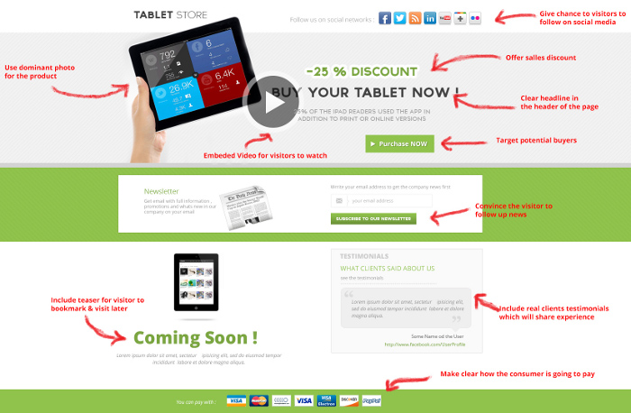
 Incorporate more interactive features as part of the users interface if you want more visitors’ on-page presence, instead of just showing a simple text. You have video on the page- that’s great! Some simple examples of landing-page-interactivity are embedded video that visitors can click and watch. Do not mistake this type of video with the one that is auto-playing with no mute button in any case.
Video can help a landing page convert better and it’s a proven conversion enhancement mechanism. The latest studies confirm that having video on the landing page is contributing up to 80% improvements in conversion.
Besides from that, it also improves the emotional and social connection of the products being sold and you can often use your video by placing it on YouTube & Google +.
Include some special “Coming Soon” or “Available in Monday” teaser-offer which can make the visitors bookmark the page and come back later.
Use a dominant photo image as your main shot: Use a product photo or, in the case of a service, you could use your logo or even a photo of your location. Make it clickable and don’t forget to add a benefit-rich caption and make sure that this image is being trustworthy and deliverers the benefits you offer. Never underestimate the importance of images and photos that can grab and hold the visitor’s attention.
Clear-ish headline or a nice and noticeable headline area is of a vital importance. Get to the focus fast and use the first 3-4 lines to say what you have to say. The visitor’s eye want to see what you are selling in the first few seconds that they land on the page so give them what they are looking for. Pay attention to the main title because it describes the final objective that matches people’s desires.
Focus on the middle of the page. Put your message, copy or image, close to the middle of your page and give an emphasis using the same colours palette on the visual elements from your ads on your landing page
Cleaner design: Make it simple and give to the user a nice and easy natural text to read with all the necessary details in the design.
Unique simple content! The landing page should be as clean as possible, easy-to-use; the content must be unique and not only that, but it has to be crafted in simple and persuasive form. The goal is to have the visitors to focus on the text you are trying to advertise and a good page design that supports the copy-write. Only copywriters who understand effective landing page design basics are skilled to craft such pages, share perceptions with designers and get final products aimed for creative & successful landing page designs.
Loading time – Slow pages lose money – Shrink the latency. No matter how great your website landing page design looks, if it loads too slowly visitors are unlikely to stay around. Depending on your marketing and your product service, strive for an 8-second or less page-load and make some necessary changes in order for your landing page to load quickly. Faster pages make a better user experience!

Convince the visitor to give you permission to follow up (by email, phone, etc.) and remember reduce the barrier in the entry form to a minimum. This includes registration of course or newsletter in return offer them statement with “Receive Updates on Webcasts” or “Participate in Webinars” , “Get the news first” instead of the cold negative interaction “Sign Up” . On long landing pages where the visitor is scrolling down for 5 or more pages use opportunity to remind the visitor about the goal of your page and place the CTA as a repeat on the bottom of the page or make it floating which moves as you scroll down. As verification to the CTA and a good way to say thanks, is to give the visitor the opportunity to spread the word out-there via Social media: Facebook, Twitter or Google +.
One important criterion in order to evaluate a landing page, even for the simple visitor: A landing page should clearly articulate what the consumer is getting and it should make clear how the consumer is going to get it.
Relevant client’s testimonials: Include real people testimonial with photos coupled with the name and the company name. They give more human touch to the product and encourage the user to become a customer.
Don’t forget, your landing page is your visitor’s last stopover to purchase a product or embrace a service, therefore target at the center and create professional landing pages that attracts visitors. The web content and the web design has to focus on boosting-up your visitor’s attention plus build confidence and trust in your product, service and your company.
 Web Design
 Telco Drafting
 Marketing, SEO, PPC & Social
 Commercial & Residential
 Graphic Design
 3D Modelling
 Hosting & Support
 Game Development
 Mobile Apps
 Other Services